I recently spent time designing a landing page for an e-commerce client. When we reviewed it internally, it was redesigned by Dan, our Growth-Hacker-in-Chief and our Traffic Team. Although I thought it was visually appealing and informative, they pointed out the not-so-obvious improvements that could be made which contribute to a higher conversion rate.
After seeing the internal review process in action, I thought I’d document the e-commerce landing page basics that I learned. Let’s jump right into it.
First Block (Above the Fold)
This is clearly the top of the landing page. It should communicate clearly these things:
- What products we’re promoting
- What is the price?
- The promotion or main selling point
- The duration of the promotion (there’s a countdown timer above the green button hidden in preview mode)
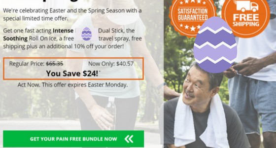
This is not the place to thoroughly explain your product’s competitive advantage. Although it is tempting to go on and on about how fantastic you think your product is, save it, this part of the landing page is about your viewer. Keep it concise and solve their problems.
In terms of design, you should aim to keep it simple while drawing the eye (through motion or colour) to the main selling points, and the primary call to action.
The idea behind the aggressive first block is to encourage impulse purchases. If people are already familiar with the product, they’ll be forced to make a decision. A “maybe later” isn’t much better than a “no,” anyway.
If someone is not familiar with the product, then they’ll scroll to the second block…
Second Block Below the Fold
The second block is focused on product features. At this point, you should be aiming to educate the viewers who aren’t familiar with your products. Clearly state the main benefits and features of your product.
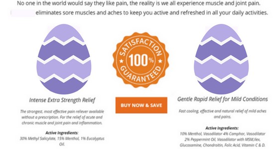
Once again, you should be keeping this concise. It’s important to communicate the most important product features, but you don’t want to overwhelm the reader with a huge fact sheet. Three to five main selling points is plenty.
For those that have recognized the value in the promotion, leave a “Buy” button on this page. As for those who are persistently skeptical, they’ll scroll to the third block…
Third Block (Further Below the Fold)
Block three is a mix of application and negative sentiment.
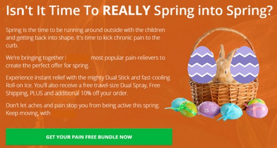
Rather than discussing product features, we applied the product to the target users’ lives and explained what their lives would be like with the product. People are paying for results—not features.
It’s also effective to add a positive or negative sentiment to a channel’s emotion. Emotion subconsciously influences purchase decisions, so we’ve harnessed readers’ negative emotions towards pain to urge them to purchase.
By now, readers will fully understand what the offer is, what the product is, and in what way it will change (improve) their lives. Some, however, will still be cautious about buying from a brand they haven’t bought from before. This is why we’ve included social proof in the fourth block.
Fourth Block: Social Proof
Here’s the final push. The goal of the fourth block is to eliminate all doubts readers might have about your product through reviews and testimonials.
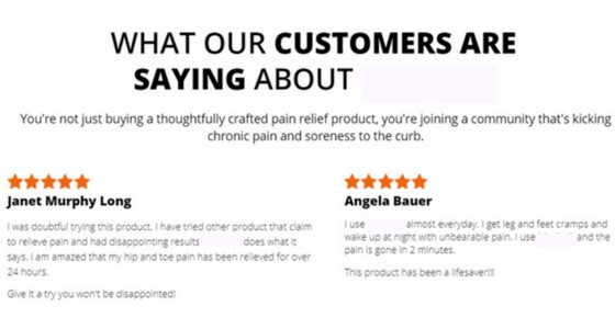
We’ve sourced reviews from the client’s online store, but screenshots of Facebook comments are even more effective because readers recognize the platform and see that they’re real comments. Here’s a good example of a comment we could’ve used:
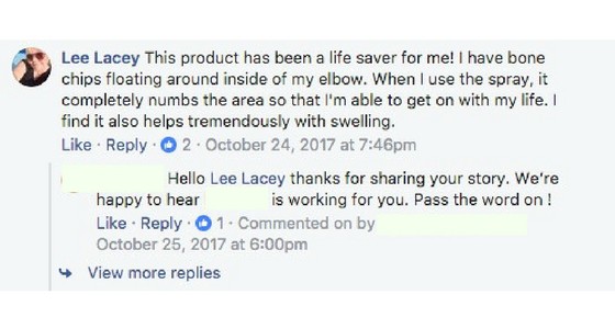
Note that there should be a button to purchase within every block. The goal is to make the buyer’s journey to a purchase extremely simple. Whether we convince them to buy in the first block or the fourth, our store should always be one quick click away.
By this point, you should be confident in the fact that you thoroughly explained the deal, product features, application, and provided social proof. If the reader still isn’t compelled to purchase, then it might not be the right product or timing.
Conclusion
It’s important to note that this landing page layout and the tactics used within are tailored for e-commerce promotions for products under $50. Your strategy could be different if you were selling cars or corporate software subscription plans.
Having said that, many of these tidbits can be applied to other parts of the buyer’s journey like your website homepage or product pages. Identify a couple places where you could incorporate testimonials, motion, urgency, or emotion in your own marketing endeavors.
Want to further increase your conversion rate? Check out this blog post on how to write compelling copywriting, when every word counts.
See you next week!

