Podcast: Play in new window | Download
Subscribe: RSS
This week, we explore the world of visual content marketing and discuss best practices, brand guidelines, KPIs, and more!
Check out the video or podcast above. 👆 Subscribe to our weekly live stream on Facebook, or take it on the go with a podcast on your chosen platform. Keep up-to-date on news, trends, and tips in digital marketing and join in on the conversation.
What’s New?
There’s always something new happening in the world of digital marketing. This week we have some interesting new tools from LinkedIn, Adverity, and Pinterest – and some drama from WhatApp. You can read more in the links below. Check it out!
LinkedIn Launches LinkedIn Marketing Labs On-Demand Courses For Advertisers – LinkedIn has introduced on-demand video courses that aim to teach advertisers how to use LinkedIn ad tools. The courses cover the basics, including an introduction to LinkedIn Ads, how to use LinkedIn ad targeting, and reporting and analytics for LinkedIn ads.
Adverity Launches Augmented Analytics – Adverity, a leading force in marketing data intelligence, launched Augmented Analytics, an automated tool for marketers. Using artificial intelligence (AI) and machine learning can access hidden insights and provide critical intelligence on data to improve marketing measurement effectiveness and maximize performance.
WhatsApp Delays Controversial Update After User Backlash – WhatsApp has caused quite a bit of commotion with a planned update to its privacy policy, which spooked users. It added more detail on how Facebook and third-party businesses can use and interact with user data on the platform.
Pinterest Adds New AR ‘Try-On’ Tools for Eyeshadow, Expands Product Tagging Within Pins – With eCommerce on the rise, Pinterest is looking to facilitate more capability assessing and comparing products, with the expansion of its AR ‘Try On’ tools to replicate the in-store shopping experience better.
What’s Working?
Visual content marketing is a crucial part of any marketing campaign.
Visual content can craft compelling messages that speak volumes without using a single word, and visuals are processed better. They produce much faster and stronger reactions than any other type of content.
Types of visual content can include:
- Images
- Videos
- Infographics
- Memes
- Quotes
- Graphs
- Typography
- and more!
We’ll take a look at examples of each type, as well as best practices and KPIs.
Let’s do it!
Why You Need a Visual Content Marketing Strategy
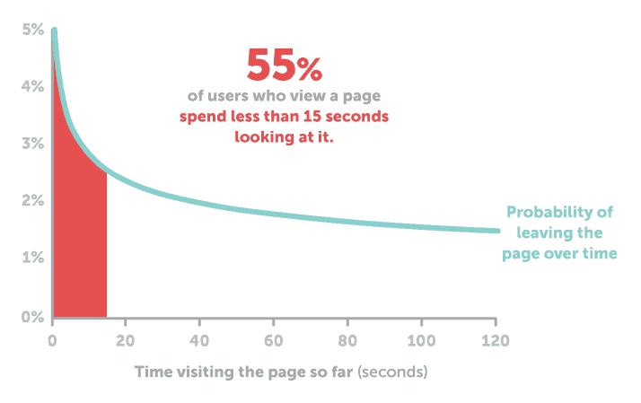
The things we see have a profound effect on us.
- 90% of the transmitted information is visual in the human brain.
- The human brain processes visuals 60,000 times faster.
- People following directions with text and illustrations do 323% better than people following directions without illustrations.
Studies have consistently shown that your content will get more views, likes, shares, retweets, and social networks; the engagement rate is higher for visual content.
These are some eye-opening statistics (cringy puns are fun, right?), coupled with the fast pace of modern living and the tremendous amount of content we’re inundated with daily; it’s easy to see why visual content marketing is essential and how it helps capture attention.
Define Your Visual Content Marketing Strategy
Before you start pumping out that sweet content, you need to develop a strategy. We talk about the importance of strategy a lot for a good reason. You don’t want to be flying off the seat of your pants and trying to guess what may or may not work.
You want to conduct thorough research, create different strategies for different channels, create a visual language that works for your brand, and then test and iterate, test and iterate.
Let’s break it down.
1. TO RESEARCH ON HOW AND WHERE TO SHARE YOUR VISUAL CONTENT
Different types of visual content perform better on other platforms.
For instance, long-form, horizontally oriented video works great on YouTube but won’t play so well on Instagram Stories.
2. CREATE A VISUAL MARKETING STRATEGY FOR EACH CHANNEL AND PLATFORM
Do your research and make a plan for what types of visual media you would like to create for each platform.
They might vary in tone, style, size, and length depending on where they live.
It might be useful to lay out this plan in a spreadsheet, so all your upcoming content is tracked in one location.
3. CREATE A VISUAL LANGUAGE AND A VISUAL WORKBENCH
How could you possibly produce enough content to fill out the 3+ social channels where you’re active, as well as your blog and your website?
You don’t have to produce entirely new content for every channel, every time.
Plan to create the type of visual content that you can repurpose as needed.
4. TEST AND EVALUATE WHAT TYPES OF VISUAL CONTENT WORK BEST AND REFINE YOUR STRATEGY
Even the best content strategies are continually changing and developing as new data is gathered and the communication landscape shifts.
Make sure to compare the success of the different kinds of visual content you produce.
Consider whether certain design styles or mediums are performing better on certain platforms.
If you’d like to dig even deeper, we talk more about strategy in this blog: Research. Strategize. Execute—3 Pillars of Building Your Brand Online.
Define Your Brand Guidelines
Consistency is essential when creating content that represents your brand.
If you are not consistent across all channels, it can make your brand look unprofessional and unorganized and create a perception of lack of trust and competence.
First impressions only happen once, and you don’t always get a chance to prove yourself a second time, so make sure you develop your brand guidelines.
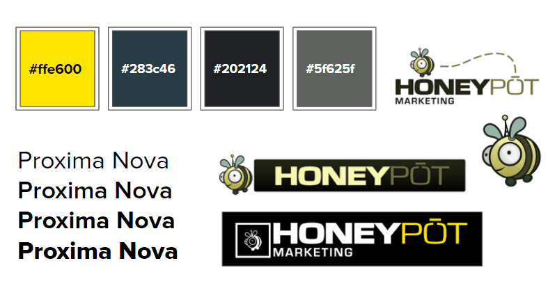
Brand Guidelines are a tool designed to give your brand consistency and flexibility.
Designers often use them to make sure they’re using the right fonts, color palettes, and logo versions.
Guidelines are a resource that everyone in the company can use to understand how to represent their brand and maintain consistency.
Define Your KPIs
Businesses today have easy access to massive volumes of data coming at them from all sides, from product usage information to customer behaviour, or support queries to budget and revenue data – and so much more.
By defining KPIs for your business, you can transform that constant stream of information into something actionable.
If you don’t know what you are trying to accomplish, it is too early for KPIs.
This is why you want to have your visual content strategy developed to begin setting your goals based on those strategies.
KPIs provide a focus for a business, but only if they’re clearly defined and easy to understand.
To get started, you’ll want to:
- Define your primary objectives – The first step toward defining KPIs is identifying your company’s main objectives. What goals are you trying to achieve?
- Determine the best indicator of success – Say your objective is to become your industry’s market leader. You determine that success would mean reaching 10,000 signups by the end of the quarter. Your KPI for that goal, then, is the number of signups.
- Limit the quantity of your KPIs – The entire point of defining KPIs is to help organize and align your business around a common goal. An essential part of keeping your team focused and united is making sure they’re not overwhelmed by unnecessary data.
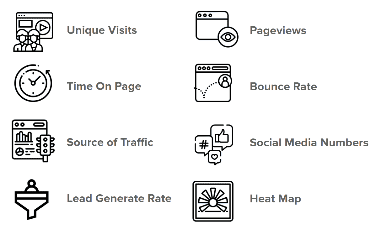
Below are some common KPIs that many businesses use to determine success:
Best Practices
Best practices are generally a handy guide for inspiration you can use for your visual content marketing, but be careful not to get stuck doing the same ‘ol thing over and over again. If everyone just followed best practices, what do you think would happen to all the content out there?
That’s right. It would all become homogenized, and everything would feel the same. It’s critically important to experiment and try new things.
And now that I’ve warned you against using best practices let’s look at some best practices you can use! 👀
- Align Visual With Text – Any content you create needs to fit with the rest. Consider how each element in your visual marketing content piece interacts with one another.
- Be Helpful – Prioritize delivering helpful information to your target audience. Being helpful primarily means understanding what your audience needs.
- Stay on Brand – Consider how your brand talks; its colours, shapes, and designs. Staying on brand also means being true to your recurring messages.
- Use Clear Call-to-actions – Visual marketing can help you get your potential leads to the next stages in the buyer’s journey. Define where you want your audience to go after consuming that piece of content.
- Repost and Repurpose – A single piece of content can turn into many others depending on your approach. A video can be turned into an infographic, or vice versa.
- Let Go of Stock Images – Everyone is tired of seeing the same photos everywhere. Plan your marketing around the tools you have at your disposal and the people at your business.

Examples
Let’s close this off by taking a look at some examples of different types of visual content, such as:
- Video
- Infographics
- High-Quality Images
- Memes
- Quotes
- Presentations
- Typography
- Graphs & Charts
Video
Videos are an excellent tool for properly communicating even the most complex subject to your audience.
They help you show your product, explain your service plans, and add a uniquely human touch.
Videos are highly versatile, as they can turn into almost any kind of content.
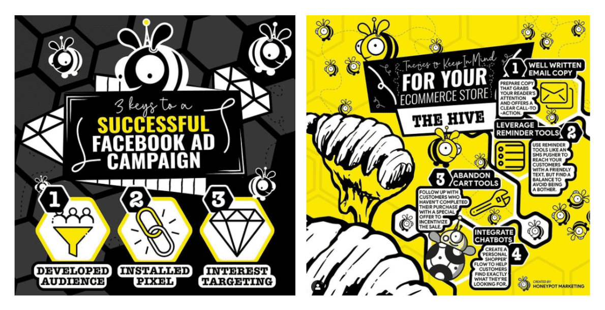
Infographics
An Infographic is a collection of imagery, charts, and minimal text that gives an easy-to-understand overview of a topic.
Presenting information in such a compelling fashion encourages visitors to spend time on your site, consuming and sharing more of your content.
They convey a world of meaning with a glance and make complex content understandable and scannable.
Remember those stats from earlier? If 90% of transmitted information to the brain is visual, then infographics are pretty much the perfect way to tell a story.
For more information, tips, examples, and templates for infographics, check out these excellent resources from Visme:
What is an Infographic? (Examples, Tips and Templates)
How to Make an Infographic: The Ultimate Guide
How to Create Animated Infographics With Visme [Step-By-Step Guide]
High-Quality Images
Great images capture attention – plain and simple.
Whether you’re adding a featured image at the top of a blog to capture attention or posting content on social media, the quality of the imagery you use will determine the content’s success.
Think about the last time you saw a low-quality image from a business. Did you click on their content? Did you go check out their website? Or, did a little voice in the back of your head tell you to steer clear from those amateurs?
It’s one thing for your cousin, Jimmy, to post a low-quality image that you ignore, but when a business does it, you immediately get an impression of that business, and it’s not flattering. And once you have that impression, it’s challenging for that business to win back your trust.
You’re not giving your cousin Jimmy money (hopefully). Still, we expect a higher standard with a business because we are trusting them to provide us with a certain level of quality for our hard-earned dollars.
This applies to all the content you’re putting out. Remember the consistency rule – it’s crucially important. So that means, even if you’re posting to social media, make sure all of your imagery is of the highest quality possible, and just as importantly, the right size.
If your images are cropped or cut off, it looks unprofessional and messy and gives the impression that you didn’t put much effort in – which is not a good look for any business.
So make sure your logo fits right, and your images are the right dimensions for the platforms you’re posting them on.
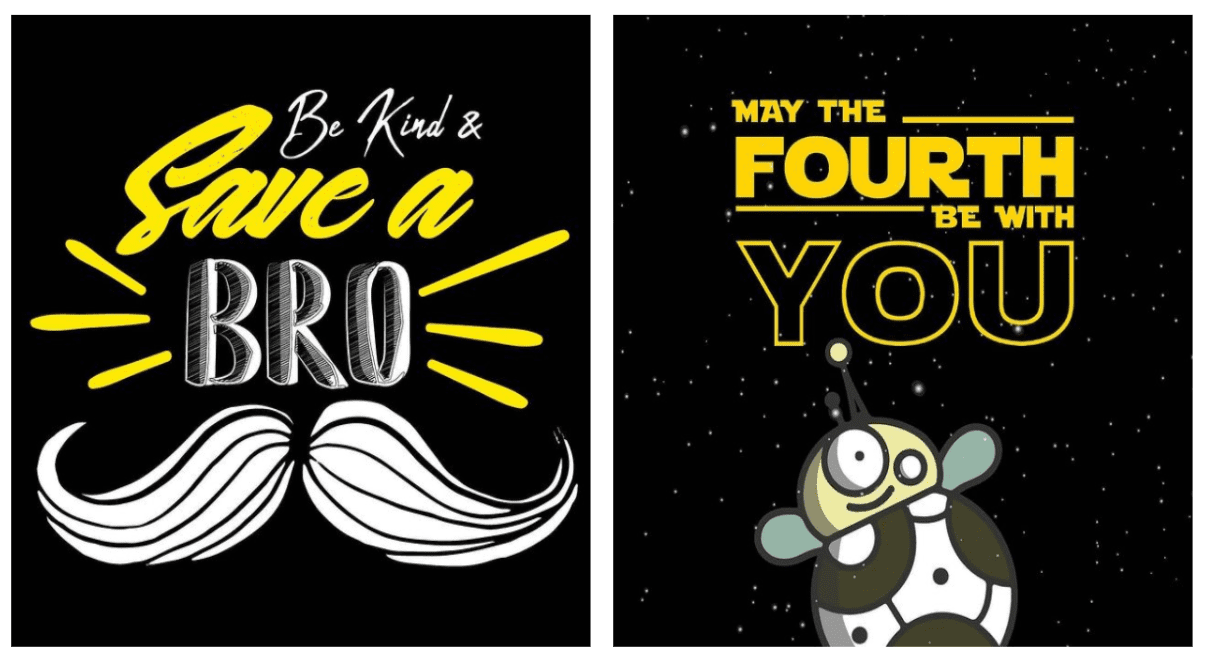
If you don’t have access to professional camera equipment or the budget to cover it, you can always make your custom images, as we did in the below example!
Memes
Remember a world without memes? I do, friends, and let me tell, the world is better with them. Aside from all the horrible and crazy stuff happening right now, memes….memes are great.
They are also highly viral and can help your brand reach a new level of discussion.
The funny images that reference pop culture, daily life, and other topics with a touch of humour can truly elevate your brand.
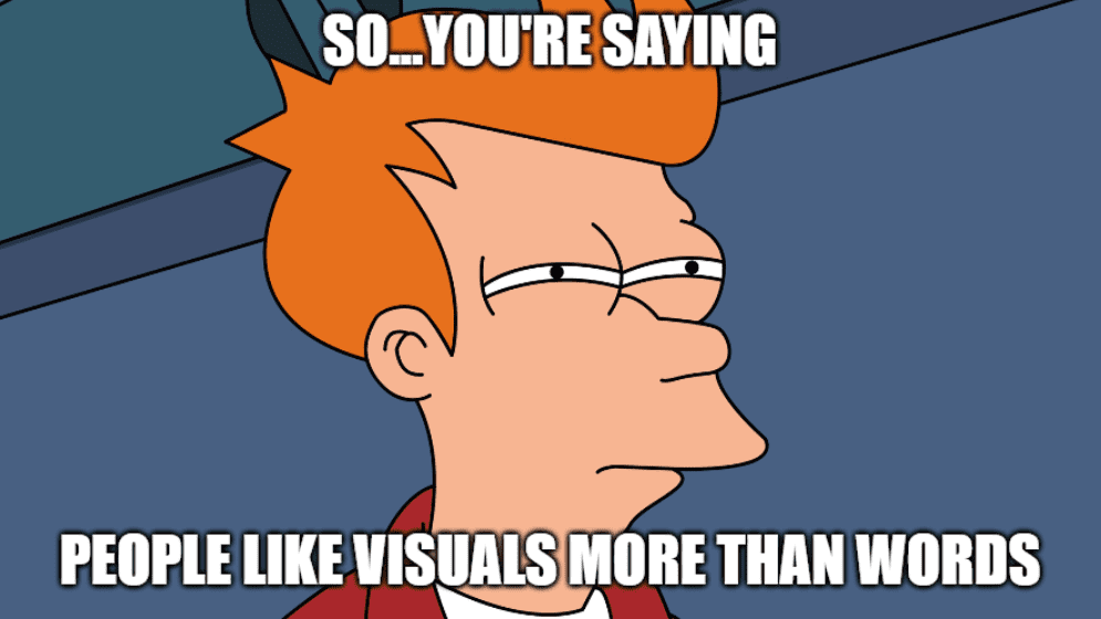
Memes are great examples of visual expression with minimal words. We use them to convey our feelings, make jokes, and relate to each other. They’ve become ingrained in our culture and everyday lives.
Of course, one does not just create memes. Humour can be very challenging and subjective and can easily go wrong – especially if you’re trying to be super edgy and cross questionable lines.
But they don’t have to be complicated or profound. They just need to be relatable, like these examples below:
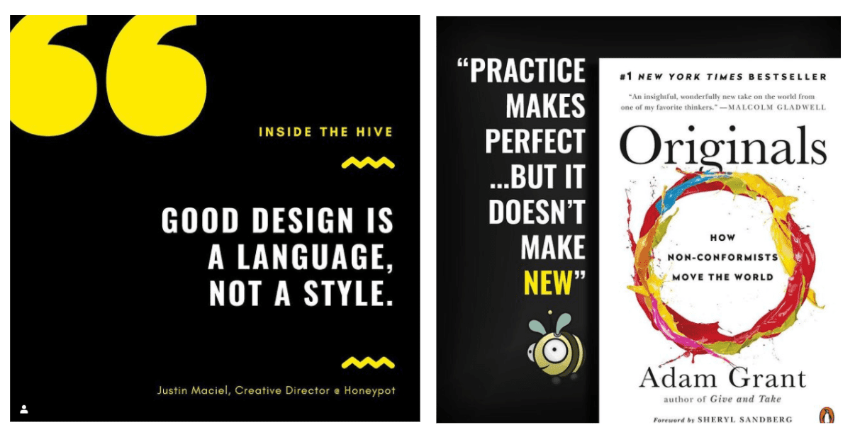
Quotes
People like reading inspiring and impactful quotes. There is an entire industry built on it.
That makes them very useful pieces of visual content and could be a perfect fit for your strategy.
Just make sure the quotes communicate with your target audience and fit your brand. As fun as random quotes and words of wisdom can be, you’ll find that your content performs better if it’s aligned with your brand.
That’s A Wrap
As always, thanks so much for reading, and we hope you found some helpful insights here for your journey into visual content marketing. If you have any questions or feedback, drop them in the comments below.
Until next time!
![]()

