What is Material Design?
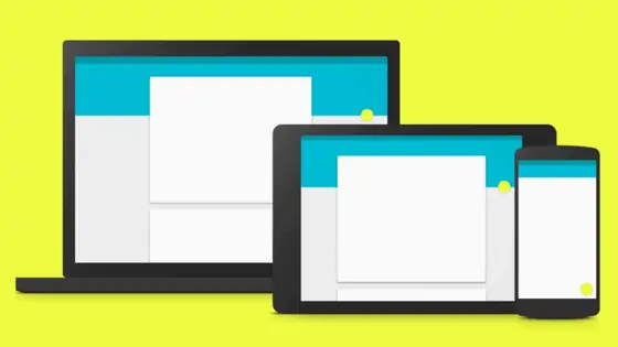
Material Design is a design language developed by Google in 2014, and has applied it to the majority of its software products, including Android OS, Chrome, WearOS, and more, all while encouraging developers of third-party apps to do the same.
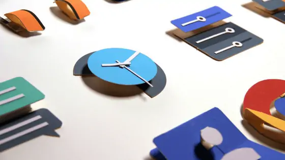
Google aimed to make elements look like physical tiles, blocks, and sheets that can flip, split, and transform. They’ve used shadows and layers to make it seem like you’re interacting with physical objects in a very satisfying, responsive way. This video illustrates that point perfectly.
Criteria
Google hoped that developers adopted this design language, so it posted formal guidelines to make a site or app with material design. A few of these criteria include:
- Materials should be solid, boldly coloured, and opaque.
- Elements should be able to split and heal, though they should be unbendable.
- Elements can move along any axis, but can only change in size along their own planes’ axis.
- Elements have varying x & y dimensions (measured in dp) but have a uniform thickness (1dp).
- Multiple material elements cannot occupy the same space simultaneously.
Google goes into great detail with this long list of criteria; take a look at the entire list here.
How Material Design Improves Conversion Rates
Now that we all understand what material design is, how can we use it to increase our conversion rates? If your app or site is using true material design, it will provide these benefits indirectly:
- Decrease Page Load Time: Due to the simple graphics encouraged by material design, the loading speed of your web page or app will improve.
- Simply Navigation: Thanks to minimalist layouts, smooth animations, and minimal computer processing requirements, navigating your web page or app will be streamlined enough to reduce conversion barriers (like extra click-through pages and pop-ups).
- Improve Brand Perception: This visually distinct aesthetic of your site or app will, either consciously or subconsciously, cause viewers to associate your brand with Google, thus increasing positive brand perceptions. It’s a clean, crisp style that fits into today’s professional design landscape.
How to Improve Conversion Rates (Above & Beyond)
Though the design naturally changes some things to increase conversion rates, there are additional things you can do that fit within the scope of material design to increase your conversion rates.
Improve Readability by Keeping the Design Clean and Simple
By keeping the content on each page organized, keeping fonts simple, and using ample spacing, the content itself becomes scannable and digestible. Good readability is essential to get viewers to scroll through all of your content and follow your predetermined customer journey.
Make Navigation Satisfying Through Intuitive Animations
You can do a number of interesting things with animations to make it appear like elements on the screen have physical properties. Poor animations can contribute to users leaving a page, while brilliant page movement and animations will elicit positive thoughts in visitors for the classic “surprise and delight” reaction.
These types of intuitive animations will make your site or app seem more professional because people are used to this type of design from Google. If not, viewers will at least recognize that you have put time and care into crafting the page. That alone sets you apart from 75% of the competition.
Draw the Eye to Calls-to-Action
Thanks to bright, bold colours and minimalist layouts, visitors will recognize your primary call-to-action without any effort (exactly as it should be).
A great way to do this is to keep most things white or grey, as though they are pieces of paper, like Google has done. With Google Docs, it’s very easy for me to see the “Share” button so I can quickly send this document to my editor.
Remember to use colour and layout in tandem with motion to draw the eye to important CTAs!
Remove Noise/Distractions with Minimalist Design
Though you may have increased readability and drawn the eye with bright colours, you should also ensure your page is clutter free. Delete all of the unnecessary noise on the page so that visitors follow the exact path you’ve intended for them.
Intrigue the Visitor with 3D Effects and Motion
Yes, you can make your app or site look professional with material design, but you can also really ‘wow’ the visitor, especially if you’re talented enough to create animations like these. Some of these animations are truly impressive (and unnecessary), which tells site visitors that your brand goes above and beyond.
Conclusion
Material design is more than just Google’s ‘look.’ Apart from its clear visual appeal, it offers numerous benefits which all contribute to a higher conversion rate.
Notably, visitors don’t recognize that you’re desperately trying to increase your conversion rate, because all they see is a simple, clean design. The same cannot be said for all websites.
Looking to increase your conversion rate even further? Check out this blog post by our very own Megan Roach to learn the basics of conversion rate optimization!

