There’s a reason why nobody engages with your page even after you’ve posted about everything under the sun: you’re not digging into social media analytics that Hootsuite provides.
It should go without saying that you need to understand what’s working and what’s flopping. We’re going to show you how to access Hootsuite’s analytics dashboard and how to make use of what you’ll find in there.
Let’s get started!
Finding the Social Media Analytics Dashboard in Hootsuite
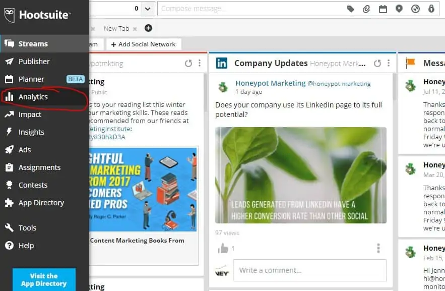
Hover your mouse over the left-hand menu in Hootsuite to pull up the list of main pages. You’ll notice a graph icon, fourth down the list from the top (not including the Hootsuite logo itself). Click on that.
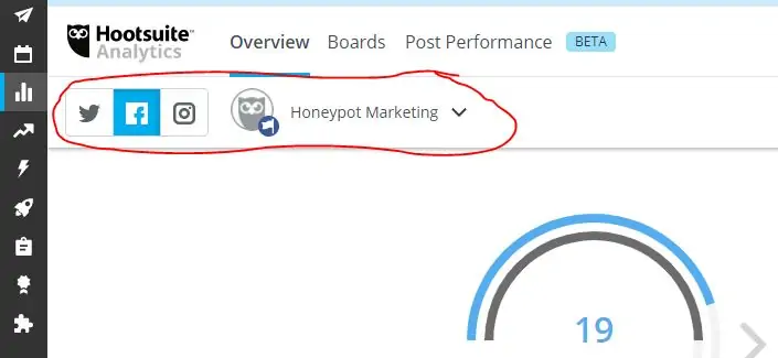
From there, you’ll land on a new page with a bunch of dashboard metrics. Before you dig into the numbers, make sure that you’ve set the correct social network and page for analysis.
It can take Hootsuite a bit of time to load the analytics for you, so don’t fret if it takes a few minutes or more.
You’ll need to select the right account separately for Facebook, Twitter, and Instagram, so I’d recommend tackling one platform at a time.
What Hootsuite’s Social Media Analytics Can Tell You
Hootsuite will put you in the Overview dashboard when you poke around the analytics section. These metrics give you a bird’s eye view of your channel to see:
- How many posts you’ve published
- How many followers you’ve gained (or lost)
- How much engagement you generated through posts and shares
- How much traffic you’ve generated through Ow.ly short links
These help you with reporting to clients or your supervisor. If you check these numbers often enough, you can also spot activity spikes to capitalize on successful posts before the moment has passed.
The Overview tab also lets you see these numbers through graphs further down the page. The real value here lies in the fact that they contain built-in comparisons to the previous month.
That month-over-month focus lets you analyze your channel’s performance over a specified window of time without the need to switch back-and-forth between months. Make good use of it to touch on insights.
The most valuable aspect of the Overview tab will be the Posts Table, hidden away at the very bottom of the screen.
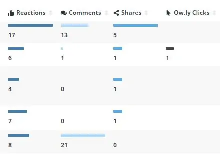
It breaks down your posts in chronological order to show you how many likes, comments, shares, and clicks were generated by each one. This is where we can really dig into the social media analytics at the granular level to engineer higher engagement.
From here, you can see exactly which posts generated engagement and traffic. More importantly, this dashboard lets you figure out why certain posts performed better than others.
Pro Tip: We’re going to draw specific insights from this dashboard in the next section, but you can get even deeper engagement metrics—such as video views and reach—from the Post Performance dashboard.
How to Analyze Hootsuite’s Social Media Analytics
Start with the Posts Table at the bottom of the Overview tab to see your top-performing posts at a glance. Use this data to pick out the common themes between your best and worst posts.
Look for these things when analyzing your posts:
- Theme
- Does the post communicate a positive or negative sentiment?
- Voice and tone
- Is a lead magnet offered?
- Content type (video, image, quotation, .GIF file, etc.)
- Are partners and influencers tagged?
We’ll try it out on our own content. Here is a clearer image of the data for our posts from the image above.
Some of these posts clearly perform better than others. Here’s what we can infer from the data:
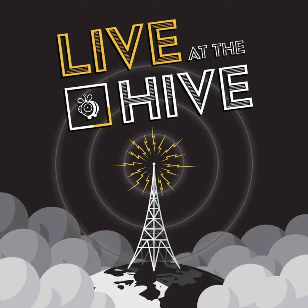
The first line with 17 likes and 5 shares is our Live at the Hive episode. It gets plenty of engagement (and 800+ views, according to the Post Performance tab), but it doesn’t drive traffic to our website.
That makes it a great top-of-funnel content series that we can use to acquire followers instead of converting them, indicating that we should promote it without making a hard sell.
Creating a Facebook Watch channel would be a good start to maximize the impact of Honeypot’s content, in this example.
The next post down the list was a co-promotion for a marketing workshop and seminar series led by our friends at Unbounce. People clearly liked it, but only one person clicked through on that post. The insight here is that Honeypot’s audience loves learning about digital marketing, but can’t necessarily commit to entire seminars in the middle of a business day.
With that in mind, we could (and should) repurpose the seminar’s key points into snackable, shareable graphics that provide value without asking for a commitment.
Now It’s Your Turn
That’s how we use Hootsuite’s social media analytics dashboard to inform our social calendars. Doing this on a monthly basis lets you phase out the posts with lukewarm receptions and phase in more content that’s proven to drive engagement.
Change the way your organization approaches social media marketing, and let us know how it goes!

